Orgmatch Case Study
Meeting the team
During the Springboard bootcamp our last project was to be paired up with a group of other Ux designers and a Company that needs a UX solution for their product or website.
The designers on our team were:
Parker McKinder (Team Lead)
Sandy Bouserhal
Bailey Rhee
Paired company
We were paired up with OrgMatch, a company based out of Vancouver BC Canada, that focuses on connecting funders with nonprofits to maximize social impact and create equal opportunities to succeed.
The Design Problem
OrgMatch was looking for a way to improve their onboarding process that helps them match funders to nonprofits that align with their needs as a company. Orgmatch had problems with users getting confused by their profile setup page and the overly simple design did not reflect the forward thinking, high tech image the company wanted to put forth.
Existing onboarding
The existing onboarding was a simple form with a couple of text fields and checkboxes. Orgmatch was after a more engaging and interactive version.
Our analysis of the existing process found that it:
Needed a more cohesive design and colors
Had information entries that could be cut because they could be learned during signup and autofilled
Didn’t prevent basic errors like selecting too many items in a limited field
Hit the user with too much information in one screen
Had little to no feedback while interacting with it
Opportunities for text fields with predictive text
Was less of an onboarding since the selections was located on the section labeled as profile making selections feel frivolous
Design research and product timeline
After meeting our client and analyzing the existing product we started looking into websites and apps that had a similar feel to the style of onboarding process the client was after and the ux principles we thought were lacking in the current process. The sites we looked at were along the lines of Duolingo, Airtable and Hinge, since we were aware they had excellent solutions to problems we found in the current web app build.
We took those ideas and made up a slide show presentation of our findings to discuss with our client. During our discussion we asked questions to ascertain the most important information to the background AI algorithm so we knew what we could modify to fit a new onboarding process.
Sketches and Onboarding User Flow
We took that input from our client and then designed a user flow for the onboarding that we felt would promote a more engaging process . The existing flow, while simple with very few steps, left users with no real feeling of feedback or progress as they entered in their information. So we prioritized splitting sections into groups that made sense in a logical progression.
We each took this new user flow and started sketching mockup ideas for each screen and then refined the sketches into simple digital wireframes to present our ideas.
The wireframes were left simple with little design added so we could further refine our knowledge of what the matching algorithm needed to function well and what could be delegated to other areas of the website's infrastructure. This allowed us to make our onboarding process shorter so that first time users could feel like they were getting to the heart of the website's functionality quickly while providing more feedback about why the information was needed and how it helped match them to a non-profit that fits their needs.
The user flow was then updated to fit this new structure and allowed for us to begin finalizing the screens for user testing.
High fidelity wireframing
Our team had limited time so we moved on to making high fidelity versions of our screens using the style guide that the client had made up.
Our screens consisted of:
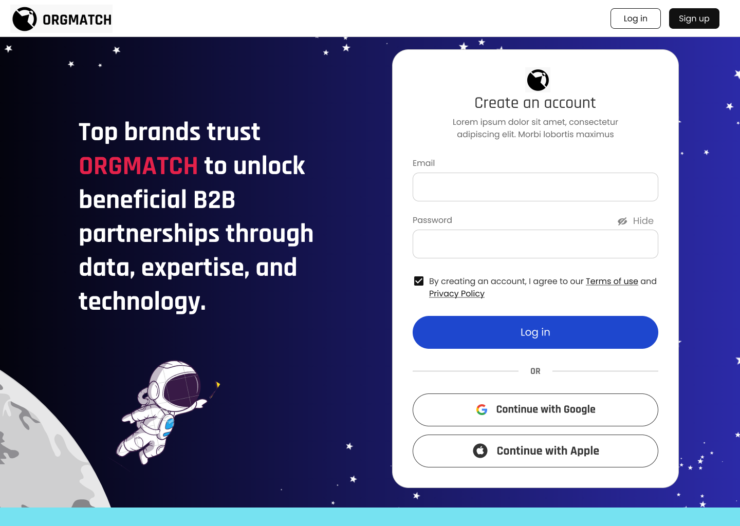
Create your account/login
Welcome page with a non profit or funder selection
Tell us about your company
Your company location
Past partner check screen
Past partnerships (would be skipped if no on previous screen)
Areas of impact
Company goals
Supplementary information upload screen
Loading/generating matches
Matches screen
Orgmatch had already put in design choices to allude to a space/high-tech theme and had stated interest in possibly including a mascot in the onboarding process. My suggestion was that an astronaut would fit and lend a human feel so we integrated that into our design decisions and used placeholder mascots for the process that the client could replace with finalized versions in the future.
Finalized designs
Once we had feedback from our users we could make some iterations on our designs.
The finalized design
The resulting iteration after user testing did not change our visual design much, only changing the way a few things were worded and a few small graphics changes.
Overall this new design improved:
Improving user text input fields
Adding visual aids to improve recognition
Adding feedback to the process to give users a sense of progress
Improved visual design
Cohesive color usage
Efficiency of information in onboarding to reduce cognitive overload
Added ability to share files like a business’ code of ethics
Our team had a great time working on this project and Orgmatch was very pleased with the end results.


